Blog

Eroski nappies and pull ups.

22/01/2013 15:00

Despite the fact that products bought for young children or babies is purchased by adults, the packaging design is still created to appeal to children. This is because often when adults purchase for children they buy things they like to think that their child would like, innocent imagery such as images of ducks and cows. This packaging has been split into two different sections of the range. One section is for young babies, despite the lack of their involvement when it comes to purchasing the packaging still seems to want to appeal to them. The reflective plastic of the packaging makes it quite robust, which is needed in a small child environment.

01 18 13 eroski 2

Images from the die line

The animals on the packaging have a dotten line around them which suggests that they can be cut out and used for another purpose. This gives the consumer the idea that this packaging can be repurposed and their child would enjoy them further.  The pale blue/green background is not overly masculine or feminie just quite delicate much like a small child would be. This prevents alienation of either parent purchasing the product or the child themselves. 


01 18 13 eroski 4

The second section of the product range is for toddlers who have out grown the 'baby' stage slightly, making the packages different colours and patterns makes it look quite cheerful and happy whilst it not being quite as childish as the previous 'baby' range. The images of the children are used to give them a sense of identity. This identity is formed more as they grow older and so it makes sense that that range, for toddlers, has more of an 'identity' about it. Both ranges have clear elements to each product in the range making them easier to identify in the supermarket and therefore easier for a parent in a rush to pick up the correct size.

The best shrink wrap pranks

17/01/2013 10:13

The shrink wrap has many uses at home. Basically, they are precisely intended in order to protect sensitive things, including leftover food, from dust and other miniscule particles which can spoil them. Of course, besides these applications, there are also other uses of the wraps at home. As a matter of fact, you can use the wraps to do some pretty awesome pranks to your family and friends.

  1. The alien invader. You can use the wraps to scare your younger siblings or relatives by wearing a wrap on your face. You have to totally cover your face with the wrap. As much as possible, it should really distort your face for maximum scare. Of course, you have to make sure that you can breathe through it. The trick is to put small holes on the part just below the nose in order to allow you to breath. This alone would already make your face scary, but you need to be more creative in order to be more effective. Basically, you can add colors to your face to make your face look like an alien. You might also want to put on some cover or blanket as this will add to the aura of mystery and horror.
  2. The nasty wake up call. As the name of the prank suggests, this involves putting wraps on the bed of the victim in order to give him a shock when he wakes up. Your intended victim should be someone who can stay asleep undisturbed despite unfavorable and irritating noise. Or, you can have your drunk friend as a victim. The trick is to make use of a lot of wraps. The unwrapped wraps should be placed beside the bed of the victim. You should do this while he is already asleep. Then, slowly, put it all over his legs and his arms. Just imagine the horror when he wakes up unable to move.
  3. The false door. This is pretty simple to do: put wraps all over the entrance of the bedroom of the toilet of your victim. There are some things that you need to consider in order to be successful at this prank. The most important is the light. Basically, there should be minimal light because the plastic wraps will reflect light and they will give away your trick rendering it futile and you foolish.

Truly, the shrink wrap is a wonder of science. It is helpful for any kind of job – the serious ones, and the funny ones.

Mucca Design

09/01/2013 13:36

Mucca Design are an award winning design company who have created many fantastic designs. I have never heard of yoga mat packaging design but they have excelled at this.

Images from Mucca Design

I am not sure there is an industry standard for yoga mat packaging however this design represents what it should be. The entirety of the yoga mat isn’t covered to save on materials but also because it really doesn't need to be. It isn't a perishable item so it doesn't need protecting from the environment however the packaging still needs to big large enough to explain what the product is and sell it to the user. The use of a hardwood floor texture as the background is slightly humorous as it is where the mat is most likely to spend the majority of its time. The product name is also a good use of packaging as its simple typography seems totally honest.

Hair Dressers Graphic Design

09/01/2013 13:06

Most industries that want the consumer to spend money with them are highly competitive, all lobbying for the consumers time and attention and one of these many industries is hair dressers and barbers. Small independent shops and chains have their own selection of stationary and cards, some of which are impeccably designed.

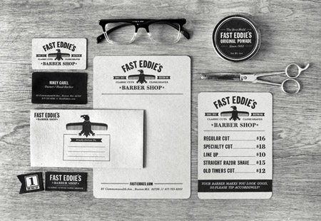
Fast Eddie's Barber Shop by Richie Stewart

Images from spoongraphics

This collection of printed materials is exactly what you'd expect to find from a barber shop, a price list, ticket, business card, comment/note paper and branding decoration for their products. This particular barber has take a vintage style simplicity to all of its graphics. The simple black and white imagery and typography is very basic and most of the text has an old fashioned style about it. All of the typography is easily readable and all is coherent across the title and small print. The background of the paper is a slightly dirty looking to reinforce the vintage style.

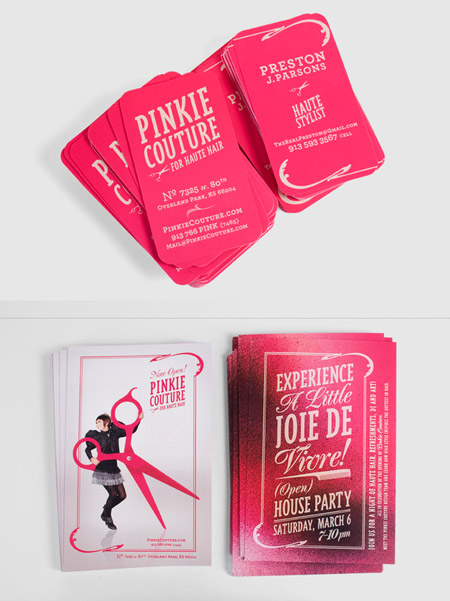
Pinkie Couture for Haute Hair by Será Será

For the most part these leaflet and business card designs are focused on typography and simple images. The vibrant pink colour contrasts nicely with the simple cream coloured font and the same with the inverse. The simple shapes of the stylist scissors and comb are repeated and their simplicity alongside the great range of fonts increases the consumers understanding as to what the company does. The slightly more complex and modern image combined with the simple style of design shown throughout makes it more eyecatching.

Why do offices need C4 envelopes?

04/01/2013 15:54

In the commercial world, packaging is part of the everyday business. Packaging is the packing of items in a container or enclosing them in a way that they will be protected. This is done for the purposes of distribution, storage, sale or use. Packaging could also refer to the container or the enclosing which houses or protects the items. The term also refers to periphery items that are used in this practise. Therefore packaging items would include cardboard boxes, mailing bags, plastic bags, envelopes, bubble wrap, shrink wrap, packing tape, and many more. In the office, packaging is done for various office items. One of the most common packaging solutions for this environment is the C4 envelopes.

The C4 envelope is one of the universal items of packaging but it is limited in its areas of utilisation. Packaging is not as straight forward as the simple mind would want to imagine, some consideration has to be put into deciding on what type of packaging is to be used for specific items. The nature of the items to be packed will dictate what type of packaging to use. For example, perishable goods are very sensitive and should be packed in special packaging that will help in preserving the perishables. Fragile items will need to be packed into packaging that will protect the fragile items from shock. Valuables will need to be packed into packaging solutions that provide security.

The C4 envelope has a size of 12.8” by 9.0”; this is the size of an A4 paper meaning that the A4 sheet can go into the C4 envelopes without any folding. This makes it very good for packing multiple sheets of paper or for packing relatively thin brochures and catalogues. It is also appropriate to use when one wants to send sheets of A4 documents that should not be folded. The envelope is made of sheets of paper slightly thicker than the normal writing paper while some are made from Manila paper. The paper is strong enough to package and send paper documents but it is not strong enough for heavier or for more valuable items.

A major advantage of C4 envelopes is that they are very light which helps reduce postage costs and makes them easy to handle. They are also very cheap since they are made from cheap, mostly recycled, paper; this makes them convenient for sending bulk mail. The office work involves a lot of paper work and the C4 envelopes offer a convenient, cheap solution. The paper can be easily disposed after use.

The packaging world gets Stranger and Stranger

04/01/2013 15:38

Stranger and Stranger is a British design company that specialise in alcoholic beverages and have created limited edition bottles for some of the most famous brands in the alcohol industry.

Images from Stranger and Stranger

It is a very rare moment when a Jack Daniel bottle is anything other than warm amber and black, this limited edition bottle however treads the fine line between special product and seeming like n entirely different brand. Taking the alcohol back to basics, Stranger have decided to strip the packaging back to basics too. Using an old fashion shaped bottle with very little in the way of decoration. To show it is indeed limited edition and also a high quality product it has a wood and cork stopper with a good finish and a simple white label that appears to have been stamped.

Taking Lillet back to it's roots by using the vintage posters that made it so popular to begin with. The beautiful blue colour looks great with the colour of the wine and overall it looks like a high luxury product. Since it's reference in Casino Royale it has become a popular product to put into cocktails of varying sorts and this bottle looks good enough to be drank as is or mixed up.


Yummy packaging design

04/01/2013 15:17

Yoomoo are a British company which sell frozen yoghurt products as well as running frozen yoghurt cafes up and down the country. Bulletproof design company worked with them to produce their product packaging for the supermarkets and because of their great packaging success, yoomoo is the next big thing.


Bulletproof

Images from Bulletproof

The amusing brand name lead to some incredibly lighthearted packaging and a fantastic brand persona. The combination of funny product names and witty information has only increased this packagings great sense of fun. The use of the cow character which changes with each flavour gives the packaging the opportunity to appeal to young and old. The different patterns and cows for each flavour gives great product distinction whilst the rest of the packaging looks exactly the same. The shape of the pot is very cute and the white and black basic shapes are both function and attractive.

Bulletproof

Bulletproof have also worked with Cadburys on the creation of their snack treats including crunchie rocks, clusters, shots, raisins and peanuts. The basic shape of all the packaging is the same with the incredibly functional tear off opening mechanism and resealing sticker. The crunchie rocks are the only product that has an existing presence in another format and the branding has been kept the same. The theme throughout all the products is the colour purple and each product has a product name in its own font along with a high quality image of the product.

Reasons why you need to stock up on packaging boxes for the January sales.

03/01/2013 16:25

At the beginning of the Christmas period, many stores and businesses will have a high demand as people rush in to buy items for their loved ones and for themselves. This leads to a general increase in commodity prices. Despite the huge demand, not all goods are sold within the Christmas holiday season. As early as on the 26th of December, some stores will advertise a sale. The sale after the Christmas holiday is known as the January sale. Normally this starts in January but some stores may start early depending on the amount of stock available. The purpose of the sale is usually to clear the existing stock in readiness for the new season stock. The prices are greatly lowered and it attracts many shoppers. January sales have been known to attract equivalent sales to those during the Christmas period and therefore store owners need to stock up lots of packaging boxes in readiness for the January sales.

When a customer buys goods from a store, they expect the goods to be conveniently packed for them so as to make it easier carrying the shopping home or to whichever destination. Proper packaging for a customer is a good gesture that never goes unnoticed. It is a great motivator in encouraging a customer to shop more often at the store. Therefore packaging should be taken seriously and the assistants at the stores should be trained thoroughly on the art. This is because; there are several packaging solutions one can use to package different items at the stores and the assistants should know how best to package each item.

A common packaging solution is the packaging box. The packaging box can store single items or many items can be put into one box. The boxes are strong and will protect the items inside in many ways. The box will offer security to the items inside and it makes it easy to manage the luggage especially when many items are stored in one packaging box. Shoppers also like packaging boxes since they can be re-used in many ways.

Before the January sales the store owners should be keen to ensure that they do not run out of packaging boxes. For the store owners, the packaging boxes are a convenient option to use as packaging for shoppers since they are cheap to acquire and can be used to pack many items at once.

B&B Studio

03/01/2013 16:08

A small English design company, B&B studio has created some fresh and inspirational designs.

Images from B&B

Firefly is a natural drinks company who's focus is on honest goodness, B&B took their packaging into the realms of vintage, reminding consumers of times where all intentions were innocent and honest. The images themselves are all black and white aside from the bright coloured fruit. Combined with the bright colour of the bottle it could be a bit too much colour making a distraction

Another popular fruit juice company has also had it's packaging designed by B&B packaging. Innocent are known for re-inventing the smoothie and making it popular again by doing things differently. This is exactly what B&B have done with this packaging, the plastic bottle is totally different from the usual cartons used by juice manufacturers, it looks like an attractive pouring jug especially when combined with its cool, brightly coloured screwcap which adds a sense of good quality to the bottle. The label is in keeping with the branding on innocents other products. The fruit imagery alongside the basic typography in bright colours with a white background.

Peck & Co

03/01/2013 15:37

Peck & Co are an American design company that work in the fields of brand, web design and packaging. Their work is young and follows the trends of the moment carefully. They have produced some of the nicest designs around in the last two years and their work always directly reflects the brand.

A small family banana jam company have worked with Peck & Co to create their entire brand, the money is featured across all of the packaging and the design is to appeal to families and young children. The name and persona of the packaging is mildly amusing and very likable, suggesting that it isn't from a commercial source but somewhere that can be trusted.

Images from Peck & Co


Jarcakes is a brand based around a baker who has created cake that can be packaged in jars. The packaging is very versatile, not only can it be used again after the cake has been eaten but the only difference in the packaging from flavour to flavour is the very top sticker. The side sticker, brown paper and card sleeve all are kept the same. The writing on the tag line is in a handwritten font to make it seem more personal. The top stickers have different decoration depending on flavour and their is a tab sticking up with the flavour on.

<< 4 | 5 | 6 | 7 | 8 >>