Spria Chocolate
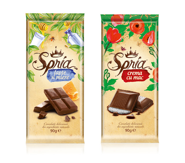
Designed by Ampro Design in Romania, this chocolate packaging design is really special. As the chocolate market begins to get crowded, it takes something really special to stand out from the crowd and this packaging does just that. Even just the shape shows that it is something special. The thinner and slimmer style of bar is indicative of a higher quality standard of chocolate. The way the chocolate is sealed in also suggests this and keeps it fresh.
The colours of the packaging although not bright or attention grabbing as such, are so down to earth and luxurious they demand attention. The paler colour scheme really compliments the high definition images of the product its self which is shown to have different fillings and flavours. For each different flavour there is an image of its key ingredient but if you look more closely the entire packaging is themed around each individual flavour.

Image from Packaging of the World
Every flavour has its own hand drawn and painted design which contains elements of its ingredients. The logo is really special. It has been created to make it look like it has been drawn in chocolate and looks very accurate unlike some cheaper imitations. The logo along with the text about the product and its flavour have been kept coherent across all of the packages and flavours giving the whole thing a unified feel.
The whole arrangement looks him quality and really goes a long way into putting the name Spria Chocolate onto the map for chocolate lovers. This packaging is miles better than most of the luxury chocolate brands around at the moment and hopefully this will inspire some competition in coming redesigns.
